Code
library(tidyverse)
library(palettetown)
library(pdftools)
library(janitor)My interpretation of forest fire data courtesy of CalFire. This page is currently undergoing updates.
For two reasons (the fact that our data lives in a PDF file plus a few other sources, and the fact that I’m using a pre-defined color palette) we need three packages in addition to the tidyverse in order to produce the plot.
library(tidyverse)
library(palettetown)
library(pdftools)
library(janitor)To begin the process of extracting the data from the pdf, let’s instantiate some objects.
pdf = "pdfs/fires-acres-all-agencies-thru-2018.pdf"
tib = pdf_data(pdf)[[1]]

tib
# A tibble: 355 × 6
width height x y space text
<int> <int> <int> <int> <lgl> <chr>
1 88 22 153 18 TRUE California
2 80 22 246 18 TRUE Wildfires
3 32 22 331 18 TRUE and
4 48 22 368 18 TRUE Acres
5 25 22 422 18 TRUE for
6 21 22 453 18 TRUE all
7 110 22 479 18 FALSE Jurisdictions
8 18 9 145 43 TRUE CAL
9 21 9 167 43 FALSE FIRE
10 26 9 116 57 FALSE FIRES
# ℹ 345 more rowspartial = tib %>%
.[23:278, c(4,6)] %>%
group_by(y) %>%
nest() %>%
pull(data) %>%
bind_cols() %>%
row_to_names(1) %>%
add_column(source = c("fires_cal",
"acres_cal",
"fires_fed",
"acres_fed",
"fires_local",
"acres_local",
"fires_total"),
.before = "1987") %>%
pivot_longer(cols = -1) %>%
pivot_wider(names_from = "source",
values_from = "value") %>%
dplyr::rename(year = name)
more = tib %>%
.[323:354, 6] %>%
select(acres_total = text)
df = partial %>%
bind_cols(more) %>%
mutate(across(2:9, ~ as.numeric(eeptools::decomma(.))),
year = as.numeric(partial$year))
rest = tibble(
year = c(2019, 2020, 2021, 2022, 2023),
fires_cal = c(3086, # 2019 value
3501, # 2020 value
3054, # ...
3333,
3236),
acres_cal = c(129914, # 2019 value
1458881, # 2020 value
279703, # ...
70933,
24971),
fires_fed = c(997 + 156 + 34 + 80 + 15 + 2, # 2019 value
1421 + 217 + 79 + 97 + 13 + 5, # 2020 value
1267 + 183 + 115 + 83 + 20 + 1, # ...
934 + 79 + 50 + 36 + 13 + 19,
1022 + 82 + 84 + 65 + 8 + 7),
acres_fed = c(1112399 + 8539 + 111+334 + 2754 + 33, # 2019 value
2520946 + 142201 + 76796 + 22210 + 45 + 11476, # 2020 value
2029239 + 30145 + 109420 + 98793 + 552 + 1000, # ...
10932 + 234624 + 3240 + 6864 + 156 + 193 + 128,
187255 + 1557 + 90251 + 201 + 8),
fires_local = c(2370 + 408, # 2019 value
2849 + 466, # 2020 value
2420 + 253, # ...
2642 + 371,
2508 + 374),
acres_local = c(7220 + 15981, # 2019 value
17062 + 54762, # 2020 value
13828 + 6706, # ...
4288 + 10932,
4936 + 18976),
fires_total = c(7148, 8648, 7396, 7490, NA),
acres_total = c(277285, 4304379, 2569386, 362455, NA)
)
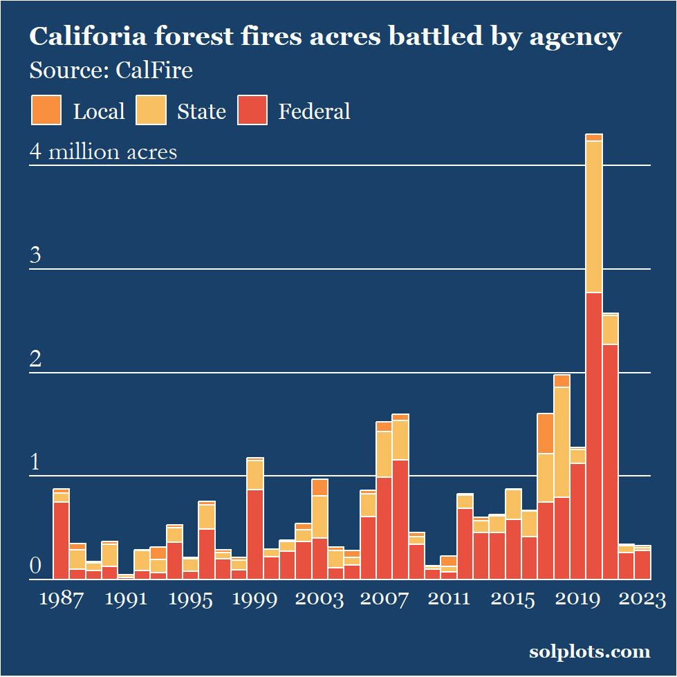
fires <-
df %>%
rbind(rest) %>%
pivot_longer(cols = fires_cal:acres_total, names_to = "type") %>%
filter(str_starts(type, "acres") & !str_ends(type, "total")) %>%
mutate(
type = case_when(
type == "acres_local" ~ "Local",
type == "acres_cal" ~ "State",
type == "acres_fed" ~ "Federal"
) %>%
as.factor(.) %>%
recode_factor(
.,
"Local" = "Local",
"State" = "State",
"Federa" = "Federal"))Pulling our color scheme from the palettetown package that produces hex codes corresponding with first-generation Pokemon. We’ll select Charizard.
char <- palettetown::ichooseyou("charizard")
extrafont::loadfonts()p <-
fires %>%
ggplot(aes(x = year, y = value/1000, fill = type)) +
geom_col(color = "white",
width = 1) +
labs(title = "Califoria forest fires acres battled by agency",
subtitle = "Source: CalFire",
x = "",
y = "",
fill = "",
caption = "solplots.com") +
scale_fill_manual(values = c("Federal" = char[11],
"State" = char[8],
"Local" = char[2])) +
scale_x_continuous(expand = c(0, 0),
breaks = seq(1987, 2023, 4)) +
scale_y_continuous(expand = c(0, 0),
limits = c(0, 4700)) +
annotate("text",
x = rep(1985, 5),
y = seq(150, 4150, 1000),
label = c(0:3, "4 million acres"),
color = "white",
family = "Garamond",
hjust = 0,
size = 5) +
theme(panel.grid.minor.x = element_blank(),
panel.grid.major.x = element_blank(),
panel.grid.minor.y = element_blank(),
panel.grid = element_line(color ="white"),
panel.border = element_blank(),
plot.title = element_text(size = rel(1.3),
face = "bold"),
plot.subtitle = element_text(size = rel(1.2)),
text = element_text(color = "white",
family = "Georgia"),
axis.text.y = element_blank(),
axis.text.x = element_text(color = "white",
size = rel(1.3)),
panel.background = element_rect(fill = char[4]),
plot.background = element_rect(fill = char[4]),
legend.background = element_rect(fill = char[4],
color = char[4]),
legend.title = element_blank(),
legend.text = element_text(size = rel(1.1)),
legend.position = "inside",
legend.position.inside = c(0.26, 0.965),
legend.direction = "horizontal",
axis.ticks = element_blank(),
plot.caption = element_text(face = "bold",
size = 10),
plot.margin = unit(c(5,5,3,0), "mm"))
p