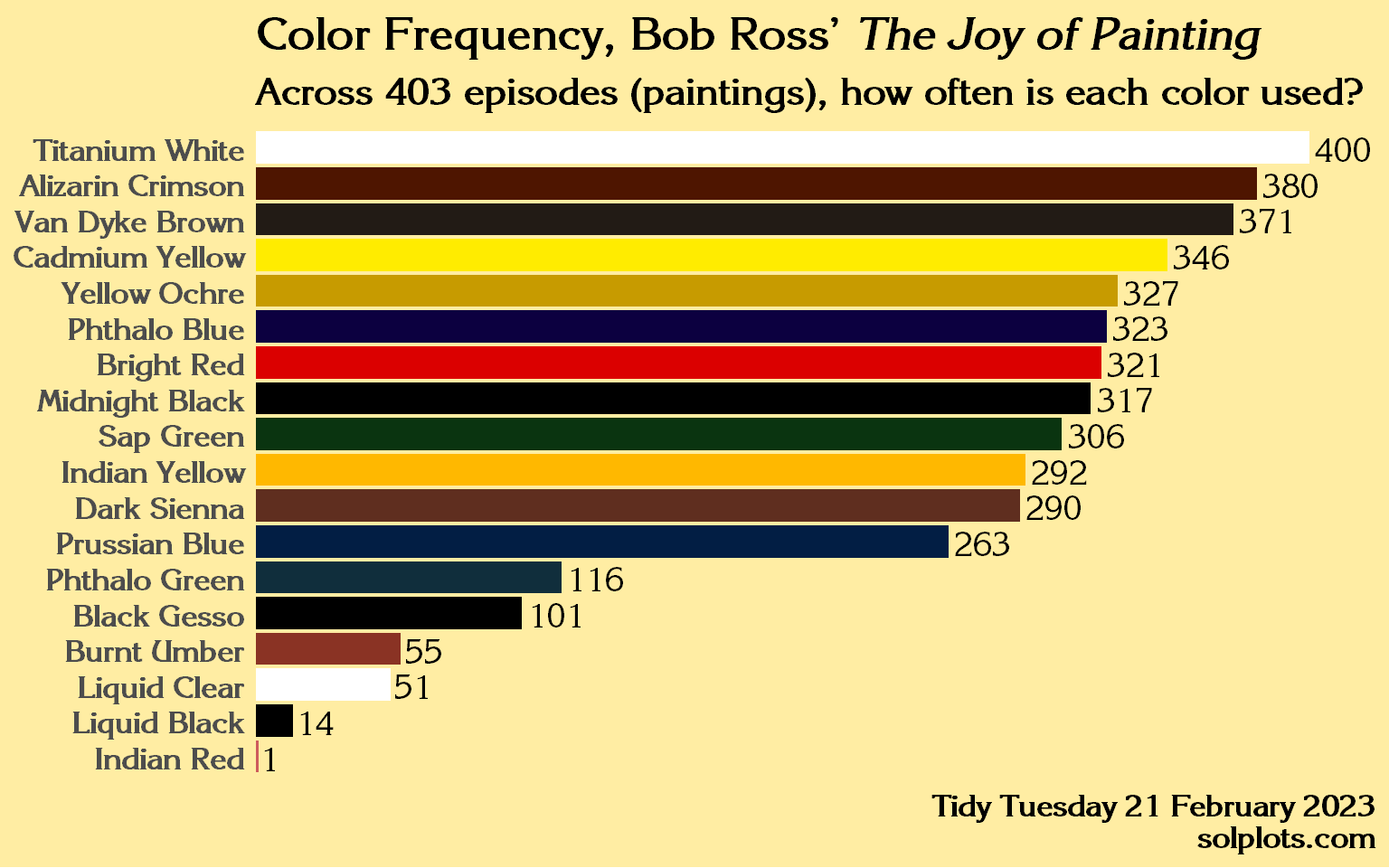
Every Tuesday, volunteers prepare a data set for people to practice data tidying and plotting skills with R. This is how I’ve interpreted Bob Ross Paintings.
Upon learning that the producers intentionally limited the show’s palette to 18 colors, I wanted to find the answer to this question: how often is each color used? As in, what is the sum appearances across all 403 episodes of these 18 colors?
It’s also a great example because this information can’t be immediately gleaned from the data set. The granularity is at the episode level, meaning 403 episodes of the show are contained in 403 observations in the data. Our target granularity is the color level, meaning we first need to create a data frame of 18 observations before we can build the plot.
The information pertaining to colors used and those colors’ hex code has to be messaged out of the source and be organized into a new data frame from which to build a plot.
Simple code reproduction
Code
# library(tidyverse)library(dplyr)library(ggplot2)library(stringr)# library(DataExplorer)library(tidyr)library(extrafont)library(ggtext)library(tidytuesdayR)#tt = tidytuesdayR::tt_load("2023-02-21")df = tt$bob_ross# font_import()loadfonts(quiet =TRUE)# total times used --------------------------------------------------------colornames =c("Titanium_White","Bright_Red","Alizarin_Crimson","Van_Dyke_Brown","Cadmium_Yellow","Yellow_Ochre","Phthalo_Blue","Midnight_Black","Sap_Green","Indian_Yellow","Dark_Sienna","Prussian_Blue","Phthalo_Green","Black_Gesso","Burnt_Umber","Liquid_Clear","Liquid_Black","Indian_Red") |>sort()## colors# get_code = function(df, var) {df |> filter({{ var }})}# get_code(df, Yellow_Ochre) |> view()cols =tibble(color_name = colornames,codes =c('#4E1500','#000000','#DB0000','#8A3324','#FFEC00','#5F2E1F','#CD5C5C','#FFB800','#000000','#FFFFFF','#000000','#0C0040','#102E3C','#021E44','#0A3410','#FFFFFF','#221B15','#C79B00' ))# aggregate sums of TRUES for each color column to arrive at total counts for each color across all 403 episodescounts = df |>select(10:ncol(df)) |>mutate(across(everything(), ~sum(.))) |>distinct() |>pivot_longer(1:18,names_to ="color_name",values_to ="count") |>inner_join(cols) |>arrange(color_name) |>mutate(color_name =str_replace(color_name, "_", " ") |>str_replace("_", " "),color_label =if_else(color_name %in%c("Titanium White", "Liquid Clear"), "black", codes))
Once we have a data frame titled counts, we can then use ggplot to visualize the data.
Code
counts |>ggplot(aes(x = count, y =reorder(color_name, count),fill = color_name,label = count)) +geom_col(show.legend =FALSE) +geom_text(aes(y = color_name),show.legend =FALSE,hjust =-.1,family ="ITC Korinna",size =5) +scale_fill_manual(values = counts$codes) +scale_x_continuous(expand =c(0, 0), limits =c(0, 425)) +theme_minimal() +labs(title ="<b>Color Frequency, Bob Ross' <i>The Joy of Painting</i></b>",subtitle ="Across 403 episodes (paintings), how often is each color used?",caption ="Tidy Tuesday 21 February 2023<br><b>solplots.com</b>") +theme(text =element_text(family ="ITC Korinna",size =16,color ="black",face ="bold"),plot.title =element_markdown(),plot.subtitle =element_markdown(),axis.title =element_blank(),axis.text.x =element_blank(),panel.grid =element_blank(),plot.background =element_rect(fill ='#FFEDA3'),panel.background =element_rect(fill ="#FFEDA3",color ="#FFEDA3"),plot.caption =element_markdown())
This is just one way to plot this data. I also liked this interpretation by Art Steinmetz.
Generated with R R version 4.5.1 (2025-06-13 ucrt) on 2026-03-17
Source Code
---title: "Color Frequency"toc: truedate: "2025-07-09"description: "Submission to Tidy Tuesday for Week 8, 2023"categories: [R, tidyverse, art, paint]image: "images/bobross_updated.png"format: html: code-fold: true code-tools: trueexecute: warning: false message: false---## Data SourceEvery Tuesday, volunteers prepare a [data set](https://github.com/rfordatascience/tidytuesday/blob/main/data/2023/2023-02-21/readme.md) for people to practice data tidying and plotting skills with R. This is how I've interpreted Bob Ross Paintings.Upon learning that the producers intentionally limited the show's palette to 18 colors, I wanted to find the answer to this question: how often is each color used? As in, what is the sum appearances across all 403 episodes of these 18 colors?It's also a great example because this information can't be immediately gleaned from the data set. The granularity is at the episode level, meaning 403 episodes of the show are contained in 403 observations in the data. Our target granularity is the color level, meaning we first need to create a data frame of 18 observations before we can build the plot.The information pertaining to colors used and those colors' hex code has to be messaged out of the source and be organized into a new data frame from which to build a plot.## Simple code reproduction```{r}#| label: setup and load-data#| code-fold: true#| output: false#| message: false#| warning: false# library(tidyverse)library(dplyr)library(ggplot2)library(stringr)# library(DataExplorer)library(tidyr)library(extrafont)library(ggtext)library(tidytuesdayR)#tt = tidytuesdayR::tt_load("2023-02-21")df = tt$bob_ross# font_import()loadfonts(quiet =TRUE)# total times used --------------------------------------------------------colornames =c("Titanium_White","Bright_Red","Alizarin_Crimson","Van_Dyke_Brown","Cadmium_Yellow","Yellow_Ochre","Phthalo_Blue","Midnight_Black","Sap_Green","Indian_Yellow","Dark_Sienna","Prussian_Blue","Phthalo_Green","Black_Gesso","Burnt_Umber","Liquid_Clear","Liquid_Black","Indian_Red") |>sort()## colors# get_code = function(df, var) {df |> filter({{ var }})}# get_code(df, Yellow_Ochre) |> view()cols =tibble(color_name = colornames,codes =c('#4E1500','#000000','#DB0000','#8A3324','#FFEC00','#5F2E1F','#CD5C5C','#FFB800','#000000','#FFFFFF','#000000','#0C0040','#102E3C','#021E44','#0A3410','#FFFFFF','#221B15','#C79B00' ))# aggregate sums of TRUES for each color column to arrive at total counts for each color across all 403 episodescounts = df |>select(10:ncol(df)) |>mutate(across(everything(), ~sum(.))) |>distinct() |>pivot_longer(1:18,names_to ="color_name",values_to ="count") |>inner_join(cols) |>arrange(color_name) |>mutate(color_name =str_replace(color_name, "_", " ") |>str_replace("_", " "),color_label =if_else(color_name %in%c("Titanium White", "Liquid Clear"), "black", codes)) ```Once we have a data frame titled `counts`, we can then use ggplot to visualize the data.```{r}#| fig-width: 8counts |>ggplot(aes(x = count, y =reorder(color_name, count),fill = color_name,label = count)) +geom_col(show.legend =FALSE) +geom_text(aes(y = color_name),show.legend =FALSE,hjust =-.1,family ="ITC Korinna",size =5) +scale_fill_manual(values = counts$codes) +scale_x_continuous(expand =c(0, 0), limits =c(0, 425)) +theme_minimal() +labs(title ="<b>Color Frequency, Bob Ross' <i>The Joy of Painting</i></b>",subtitle ="Across 403 episodes (paintings), how often is each color used?",caption ="Tidy Tuesday 21 February 2023<br><b>solplots.com</b>") +theme(text =element_text(family ="ITC Korinna",size =16,color ="black",face ="bold"),plot.title =element_markdown(),plot.subtitle =element_markdown(),axis.title =element_blank(),axis.text.x =element_blank(),panel.grid =element_blank(),plot.background =element_rect(fill ='#FFEDA3'),panel.background =element_rect(fill ="#FFEDA3",color ="#FFEDA3"),plot.caption =element_markdown()) ```This is just one way to plot this data. I also liked this [interpretation](https://github.com/apsteinmetz/tidytuesday/blob/master/Rplot.jpeg) by Art Steinmetz.------------------------------------------------------------------------*Generated with R `r R.version.string` on `r Sys.Date()`*